contact us

Curious to learn more about custom/retail fonts or font services?
Send me a note and I'll get back to you typically within 24 hours.

Email: neil@greyletter.com


Portland, Maine

207 200 3470

Neil Patel is the designer behind Tetradtype, an independent digital type foundry that crafts custom and retail fonts for creatives. Before founding Tetradtype in 2009, Neil spent a decade working as a semiconductor process engineer specializing in sub-micron printing—an experience that compels him to balance the aesthetic with the technical. 

design

An assortment of Greyletter's Work


Filtering by Category: Font

NCR Custom Font

Neil Patel

Custom digital font designed to match printed in-store receipts

Custom digital font designed to match printed in-store receipts

Brief

NCR, well known for the their cash register and POS systems, approached me to create a custom digital font for a client's POS system. This client needed to generate digital receipts for their retail customers, and the digital versions needed to exactly match the appearance of printed receipts that customers would receive in retail locations. Matching the appearance of the printed and digital receipts adds continuity to the customer's experience.

POS systems use thermal printers to generate receipts. A thermal printer works by locally heating thermally sensitive paper to darken it. This method is similar to a dot matrix printer but without the ink and the noise. The typeface that is built into the printer firmware is a simple mono-width bitmap font. Typographic differentiation is performed by scaling the letterforms (double-height, double-width, or both).  The typographic quality of printed receipts certainly is not what one would consider elegant, but the thermal printer is a simple and robust device that can keep up with the demands of a retail environment. 


Design

The challenge in developing a digital equivalent of the printer typeface is that the original is effectively made up of pixels. The only way to see the letterforms is to print it out. This meant that a fair amount of interpretation is required to determine the "design intent," particularly while working from scanned copied of receipts as the source. 

On the printed receipt the rendering of the characters is blurry. However, on a crisp digital version vagueness would be distracting. Part of the design process was to create rules for some features of the letterforms, while still retaining the thermal-printed, pixelated aesthetic. Amongst the things to consider were adding overshoots to the rounded letter and standardizing how the strokes terminate. All designs then had to be scaled and tested to see if their form resembled the scaled versions of the original.

Original printed character set from the thermal printer.

Original printed character set from the thermal printer.

Digital character set

Digital character set

IDEXX Custom Font

Neil Patel

Print ad using custom typeface

Print ad using custom typeface

Brief

IDEXX Laboratories was kicking off a new ad campaign to promote some of their pet health diagnostic products. The creative team at IDEXX developed a campaign that spoke to the emotional bonds between people and their pets. Visually, this was achieved with full spread photographs capturing a touching moment between people and their pets, with a headline representing the thoughts of the pet owner. To fit in with the visual language, the typeface had to feel human as well. Originally, the team at IDEXX chose a retail typeface that was hand-drawn and had a hatched 3-D effect. While this typeface had the right feel it was difficult to read and was missing necessary punctuation.


Design

To resolve these issues IDEXX approached me to create a custom typeface. The goal was to retain the human, light-hearted, bouncy nature of the original typeface but improve the legibility. The primary reason the placeholder typeface was difficult to read was that it used high contrast letterforms with hairline serifs. The density of the 3-D effect overwhelmed the thin strokes of the letter. To solve this I suggested using a san-serif design with medium stroke contrast. This would reduce the clutter between letters and create a better balance between the 3-D effect and negative space inside the letter outlines.

Full alphabet and figures in custom font (Inside Voice)

Full alphabet and figures in custom font (Inside Voice)

Detailed view

Detailed view

Pushing the Concept

Commissioning a typeface with hand-drawn letters makes much more sense than illustrating each individual headline over a period of years. The drawback, however, is that a typeface of hand-drawn letters doesn't do enough to give off the organic human feel that was desired. This is because the letters repeat. To remedy this, I proposed that we add a variety of alternates for the most commonly occurring letters and pseudo-randomly substitute them in using the contextual alternate OpenType feature. The feature was coded to prevent the same alternate from appearing in close proximity to itself thus adding the variation needed to feel more hand produced.

Illustration of how alternate letters are substituted

Illustration of how alternate letters are substituted

Cartoon Network Custom Font

Neil Patel

Sample.png

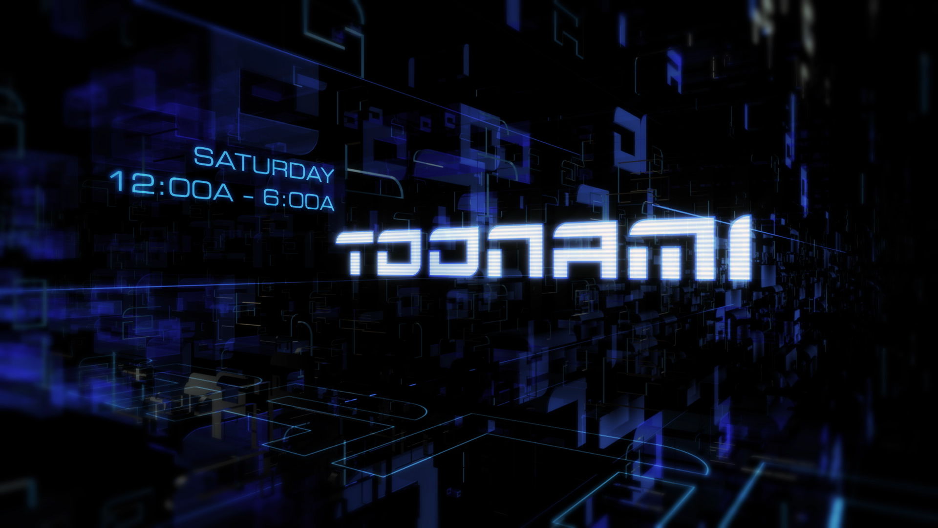
Dynatherm is a custom font developed as part of the 2013 re-brand of the Toonami programming block on Cartoon Network’s Adult Swim. Scott Frizzle and Associates designed the new logotype as part of an updated brand that included on-screen graphics and animation. To support the brand, Scott needed to expand the logotype into a complete character set.

The goal of the custom font was to carry through the modular design of the logotype while maximizing its legibility. While the font was not expected to be used for large bodies of copy, the nature of the design poses character recognition concerns. The inter-letter spacing and the stroke width are very similar in this design, meaning that if too many gaps were present it would be difficult to easily recognize distinct letterforms. To manage this concern, the gap in the letterforms was used sparingly and was limited to the upper third of the letters and to the horizontal orientation. In general, placing the gap where one would expect the beginning of a new stroke worked the best. The figures posed a unique challenge in that a break in the stroke greatly diminished one's ability to distinguish one number from another, particularly amongst the 3, 5, 6, and 9. Since the numbers were most likely to be used for show times and schedules, it was important to make sure these could be recognized easily. As a result, the figures all use unbroken strokes, which in turn prevents confusion with similarly shaped letters.

Another design feature to note is the difference in the “O” used in the logotype vs. the font. This distinction was necessary to prevent confusion with the letter “D.” The font contains an Opentype feature that substitutes in the square-cornered “O” when the word “Toonami” is typed.

In-use images provided by Scott Frizzle.

STEED 2010 Campaign

Neil Patel

STEED2010_logo_stack.jpg

In late 2009, I had the pleasure of designing a custom logotype for Alex Steed’s ME State House Campaign.  Running as an independent, he was looking for lettering that differentiated his campaign from the familiar: bold, in-your-face type to encourage action without being off-putting.  The result was block letters softened with curves on internal edges.

One of Alex’s primary campaign platforms was to promote local artisans, business and agriculture.  This was carried into the logo design by giving all of the characters a textured treatment.  To accomplish this I partnered with graphic designer and illustrator Arielle Walrath, to add a hand-painted texture to each letter-form.

STEED_TMKF.jpg

Months after the STEED 2010 logo design, Alex was looking to create a t-shirt with a Woodie Guthrie quote to support his campaign with lettering that matched the logotype design.  This logo also is used for his non-profit that supports engagement of the community in local politics.