contact us

Curious to learn more about custom/retail fonts or font services?
Send me a note and I'll get back to you typically within 24 hours.

Email: neil@greyletter.com


Portland, Maine

207 200 3470

Neil Patel is the designer behind Tetradtype, an independent digital type foundry that crafts custom and retail fonts for creatives. Before founding Tetradtype in 2009, Neil spent a decade working as a semiconductor process engineer specializing in sub-micron printing—an experience that compels him to balance the aesthetic with the technical. 

design

An assortment of Greyletter's Work


Filtering by Category: Logotype

Rising Tide Logo Improvements

Neil Patel

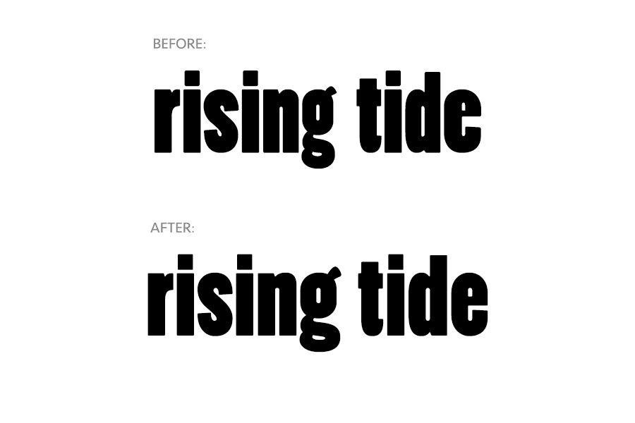
Before and after image of Rising Tide logo

Before and after image of Rising Tide logo

Since 2010, local craft brewery Rising Tide has been producing artisanal small-batch beer which has been widely available in New England on tap and in 22oz. bottles. In 2014 they made the move to have there more popular varieties available in 12oz. 4-packs. To pull it off they hired Might & Main to design the new labels and carriers.

Seeing this as a good opportunity to refine the existing brand Might & Main asked me to fine-tune the logotype. The original logo is set in Poplar, which is also used elsewhere in the brand, primarily for the names of the beer. Poplar is a digital revival of a wood cut typeface designed by William Leavenworth in the early 1800's. Most of the wood type of that time was designed to be used at large sizes and to be eye-catching. There were also the mechanical limitations that prevent from any part of one letter overlapping into the space occupied by another. With all of this often comes some eccentricities that in large bodies of text translate into texture but when setting only one or two words looks awkward. This is due to the lack of repetition in the eccentric features.

In the original logo the most awkward letters are the g and the e. The lower part of the g is dwarfed by the upper making it have bobble-head-like proportions. The e opens up into a large aperture that makes it have a large mouth that clashes with the neighboring letters. If these two letters happened to be in middle of the word it my not be as noticeable but in this case they both occur at the end of the word which makes them stand out more.

Improvements to the letterforms focused primarily on redrawing the g and e to achieve better balance with the rest of the logo. In addition, to those changes stem-widths, counter heights and overshoots were standardized to achieve better harmony.

Comparison of old and new outlines

Comparison of old and new outlines

New 4-packs on store shelves
New 4-packs on store shelves

Hugo's Custom Logotype

Neil Patel

Logotype in use

Logotype in use

Client

Originally opened in 1988, Hugo's has become a fixture in the Portland restaurant scene. Hugo's has become known for their fixed price tasting menus with meticulously created and well-balanced experimental dishes. Over the years, the restaurant has seen a few ownership changes, the most recent being in 2011. In 2013, the new owners undertook an overhaul of the interior space and brand identity. Having just worked with the same owners on the successful launch of their oyster bar, Eventide, Portland agency Might & Main was asked to work on the brand redesign for Hugo's as well.


Design

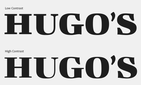
Might & Main set out to create an identity that was inspired by turn-of-the-century Portland. The renovated interior space was serious, yet warm and inviting. Everything about the brand identity would be custom and luxurious: embossed leather menus, letterpressed paper, and gold foil leaf on the windows. and the new logotype needed to fit into that environment. Might & Main had a vision of a sturdy high contrast typeface with an engraving-style stripe treatment that played well with secondary typefaces, Engraver's and Tungsten. However, after an exhausting search, they were unable to find a retail typeface for the logo that really hit the correct note.

Using their initial mockup and design brief as a guide I started to draw up a handful of options. I worked primarily on the core letterforms, leaving the striped treatment aside for the time being. After all, if the main structure of the logo letter was not solid, adding stripes would not make it better.

Core letterforms of the logotoype

Core letterforms of the logotoype

Wearing the Right Stripes

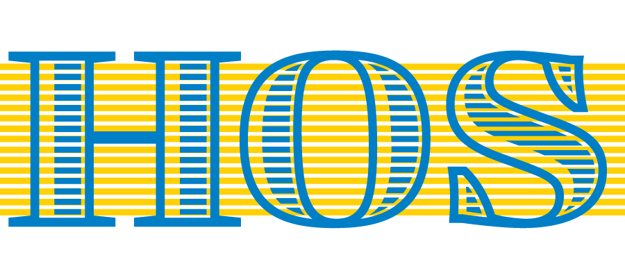
Adding stripes is not as simple as picking a size and applying it across all of the letters. A good logo needs to work across all of the applications in which it will be used. In the case of Hugo's, this runs across a broad range of sizes from 4' wide signage in the windows to gift certificates and 2" wide business cards. The stripes that look good at a large size are not appropriate at a small size. After reviewing all of the potential applications with Might & Main we settled on 5 versions of the logo for sizes from 1.5" to 48".


Versions of the logotype for use at various sizes

Versions of the logotype for use at various sizes

Beyond the complications of dealing with various sizes, the stripes within each size need to be optimized to appear even and balanced. The length of the stripe affects its visual weight. In particular, near the top and the bottom of the rounded letters (G, O and S) the stripes have to be thickened to appear as if they are the same weight as stripes that fall in the center of the letters.

Illustration of stripe optimization

Illustration of stripe optimization

In the end we had developed a unique logo system that could deal with a breadth of uses, with an attention to details befitting the level of consideration the owners of Hugo's give to their food and atmosphere.

Tattoo Design: Undertoad

Neil Patel

Garp…realized that all these years Walt had been dreading a giant toad, lurking offshore, waiting to suck him under and drag him out to sea. The terrible Under Toad.
— John Irving, The World According to Garp

Walt’s misunderstanding of the undertow he was supposed to be mindful of at the beach in John Irving’s, The World According to Garp becomes a metaphor for feelings of fear and anxiety regarding the unknown. The World According to Garp is great story and I was excited to be approached to design a tattoo of the word, UNDERTOAD. My client wanted the tattoo to be reminder of her own feelings of foreboding in life. The tattoo was not to serve as a way to revel in the anxiety, but as a way to give these emotions a tangible form that helps her remember that such feelings are surmountable.

undertoad.jpeg

We discussed the mood the lettering should convey in visual terms. The dominant imagery was the heavy grey sea—taking more inspiration from "undertow" than "Under Toad." In addition, the client was looking for the lettering to also be reminiscent of the artwork from old editions of Hans Christian Andersen books. These stories were also something she identified with strongly and the whimsical aesthetic serves as an excellent way to temper the depressing nature of “The terrible Under Toad.” The joining of these two moods was the key in transforming the tattoo from a dark reminder to a hopeful one.

Working from these emotional inputs, I decided that the type should take its core structure from lettering that would have been seen on the side of an old Dutch ship from the 1600′s. To bring in this complex sense of foreboding whimsy I made all of the vertical strokes about 20% wider at the base and widened the horizontal strokes close to the stems. Structurally this gives the illusion that the letters are collapsing under their own weight. Since the widening of the strokes primarily happens in the interior side of the stems, there is an alternating pattern of vertical and off-kilter edges, making it appear as if the letters are rotated in a quirky way. I also placed certain letters slightly above or below the baseline, which is a common feature of the typesetting seen in the Hans Christian Andersen books.  All of these elements work together to create the mixture of emotions that the client was looking for.

The design was tattooed by the steady-hand of Cyndi at Squid & Whale Tattoo, right here in Portland.

Maine Wedding Company Custom Logo

Neil Patel

MWC_logo_RGB.jpg

The Maine Wedding Company is an online wedding planning guide that brings together information about wedding vendors, venues, ideas and experience to help plan a beautiful Maine wedding. The service needed a logo that was elegant and timeless to match the quality of the wedding experience it helps to shape. Working with Arielle Walrath of Might & Main (the branding agency on the project), I chose to execute the name of the company alongside a monogram evocative of fine wedding stationery.

The first step of the process was to choose a typeface for the brand. After much research we settled on Spira, which not only had the right character on its own but was subtle enough to work with other visual elements. The MWCo monogram was designed to be simple and bold. An overly ornate monogram would have been too distracting and may have competed with elegance of the type and would lose its sense of impact. The monogram also needed to be designed such that it could be easily read at small sizes with minor adjustment. This was important as the monogram also serves as a favicon and web badge for partnered vendors.

MWcoWeb.jpg

Kevin Brooks Design & Development Logo

Neil Patel

kblogotype.jpg

Kevin was looking for a identity piece that was bold, approachable and spoke to his field of work. Using braces in the logo illustrates that he is a programmer and I was able to incorporate the right brace into his name forming the leg of the ‘n’ and the ‘s.’ Kevin has used the logo on his website, business cards and promotional pint glasses.