Hugo's Custom Logotype
Neil Patel

Logotype in use
Client
Originally opened in 1988, Hugo's has become a fixture in the Portland restaurant scene. Hugo's has become known for their fixed price tasting menus with meticulously created and well-balanced experimental dishes. Over the years, the restaurant has seen a few ownership changes, the most recent being in 2011. In 2013, the new owners undertook an overhaul of the interior space and brand identity. Having just worked with the same owners on the successful launch of their oyster bar, Eventide, Portland agency Might & Main was asked to work on the brand redesign for Hugo's as well.
Design
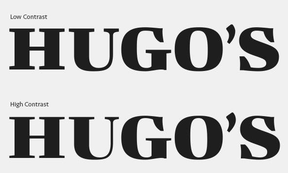
Might & Main set out to create an identity that was inspired by turn-of-the-century Portland. The renovated interior space was serious, yet warm and inviting. Everything about the brand identity would be custom and luxurious: embossed leather menus, letterpressed paper, and gold foil leaf on the windows. and the new logotype needed to fit into that environment. Might & Main had a vision of a sturdy high contrast typeface with an engraving-style stripe treatment that played well with secondary typefaces, Engraver's and Tungsten. However, after an exhausting search, they were unable to find a retail typeface for the logo that really hit the correct note.
Using their initial mockup and design brief as a guide I started to draw up a handful of options. I worked primarily on the core letterforms, leaving the striped treatment aside for the time being. After all, if the main structure of the logo letter was not solid, adding stripes would not make it better.
Core letterforms of the logotoype
Wearing the Right Stripes
Adding stripes is not as simple as picking a size and applying it across all of the letters. A good logo needs to work across all of the applications in which it will be used. In the case of Hugo's, this runs across a broad range of sizes from 4' wide signage in the windows to gift certificates and 2" wide business cards. The stripes that look good at a large size are not appropriate at a small size. After reviewing all of the potential applications with Might & Main we settled on 5 versions of the logo for sizes from 1.5" to 48".

Versions of the logotype for use at various sizes
Beyond the complications of dealing with various sizes, the stripes within each size need to be optimized to appear even and balanced. The length of the stripe affects its visual weight. In particular, near the top and the bottom of the rounded letters (G, O and S) the stripes have to be thickened to appear as if they are the same weight as stripes that fall in the center of the letters.
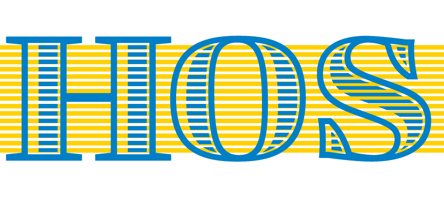
Illustration of stripe optimization
In the end we had developed a unique logo system that could deal with a breadth of uses, with an attention to details befitting the level of consideration the owners of Hugo's give to their food and atmosphere.